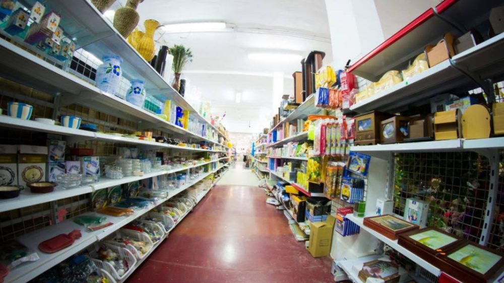
As a retailer, you’re well aware that the success of your store isn’t just about the products you sell. It’s about the overall shopping experience you provide. You might have yet to give much about store fixtures, but they’re more important than you’d think. They’re not just tools to display your products; they guide your customers’ journey, highlighting key products and leading to increased sales. Could your store be performing better with a strategic revamp of your fixtures? Let’s explore this further.

Understanding Retail Store Fixtures
To truly elevate your retail environment, you’ll need to clearly understand store fixtures and how they can be innovatively utilized to display your merchandise effectively, drive customer engagement, and, ultimately, boost your sales. Think beyond the traditional shelves and mannequins; consider the variety of fixtures available. There’s a whole spectrum out there – from display cases that enhance the perceived value of your products, gondola displays adept at promoting multiple items, to counter displays that can effectively upsell last-minute purchases.
It’s not just about selecting the right fixture; it’s also about how you use them. Your store layout should be dictated by the shopping behavior of your customers. You’ve got a few precious seconds to capture their attention – use it wisely. Position your fixtures strategically, creating a visually pleasing and engaging shopping journey.
Lastly, remember that your fixtures are an extension of your brand. They should not only serve a functional purpose but also resonate with your brand’s identity. Choose fixtures that align with your brand aesthetics and watch how they transform your retail environment, making your products simply irresistible.
Essential Elements of Display Fixtures
When selecting the appropriate display fixtures for a retail store, it’s essential to take into account four key elements: visual appeal, versatility, durability, and strategic placement.
Visual appeal is your first impression. Choose fixtures that complement your merchandise and enhance the overall aesthetic of your store. Consider the color, material, and design of your fixtures. They’re not just a platform for your products; they’re a part of the shopping experience.
Versatility is a must. Your store’s inventory will change over time, and your fixtures should be able to adapt. Opt for modular systems that can be easily rearranged to accommodate different products and display needs.
Durability is about longevity. High-quality fixtures may be a larger upfront investment, but they’ll stand up to wear and tear, making them more cost-effective in the long run.
Principles of Effective Store Design
Understanding the principles of effective store design isn’t just about aesthetics; it’s a strategic approach that can greatly enhance your sales if executed correctly. It’s all about creating a space that not only showcases your products but also encourages customers to explore and make purchases.
Firstly, consider your store’s entrance. It’s your first chance to make an impression, so use eye-catching displays that encapsulate your brand’s unique selling points. From there, guide your customers through a journey, using strategically placed fixtures to direct their attention towards key products or promotions.
Secondly, be mindful of your customers’ natural flow. Most customers tend to turn right upon entering, so capitalize on this by placing high-interest items or deals in this area. Continually observe and adapt to your customer’s shopping behaviors to optimize product placement further.
Overview of Store Layout Types
In the world of retail, your store layout plays a vital role as a silent salesman, subtly guiding customers through a journey of discovery and purchase. It’s important to understand the different types of layouts you can employ to optimize your space and enhance your customers’ shopping experience.
The first is the grid layout, a classic and efficient design commonly seen in grocery stores, where aisles guide customers methodically through the store. This layout is perfect for fast, focused shopping experiences where customers know what they’re after.
Next, there’s the loop or racetrack layout. This design guides customers around the store in a set path, maximizing their exposure to products. It’s ideal for general merchandise stores where browsing is encouraged.
The third layout type is the free-flow design. This layout offers the most creativity and flexibility. Products are arranged in groups, and customers are free to wander. This layout works best in high-end boutiques or stores with unique products that warrant exploration.
Best Practices for Interior Design Strategy
Building on the importance of store layout, let’s explore how an effective interior design strategy can greatly enhance your customers’ shopping experience while showcasing your products in a compelling light. A strategic interior design approach influences customer behavior, maximizes space, and highlights your products.
-
Color Theory: Use color to evoke emotions and influence purchasing decisions. Bright colors like red and yellow may trigger impulsive buying, while cooler tones like blue and green create a relaxed atmosphere. Make sure your color scheme aligns with your brand’s personality.
-
Lighting: Lighting is a powerful tool that can highlight products, create an atmosphere, and guide customers through your store. Use different types of lighting, such as ambient, accent, and task lighting, to create a dynamic environment.
-
Store Fixtures: Choose store fixtures that suit your products and enhance their appeal. For clothing, use mannequins to show how items look when worn. For smaller items, opt for glass display cases to create a sense of exclusivity. Remember, your fixtures should create a seamless flow and easy navigation for customers.
HedgeThink.com is the fund industry’s leading news, research and analysis source for individual and institutional accredited investors and professionals


